← Alle artikelen← All articles
Wat bedoelen we met witruimte?
What do we mean by whitespace?
Witruimte is geen “verspilde” ruimte op je scherm: het is de adem tussen titel, paragraaf, knop, formulier en foto. Net zoals in een fysieke winkel waar je rustig tussen de rekken wandelt, geeft digitale witruimte je brein tijd om te begrijpen wat belangrijk is en wat later komt. Zonder die pauzes stapelt informatie op elkaar en voelt een pagina snel chaotisch, zelfs wanneer elk onderdeel op zichzelf “mooi” ontworpen lijkt.
Whitespace is not wasted screen space: it is the breathing room between headings, paragraphs, buttons, forms, and images. Like aisles in a physical shop, digital space gives your brain time to see what matters first and what can wait. Without pauses, information stacks up and a page feels chaotic even when each block looks polished on its own.
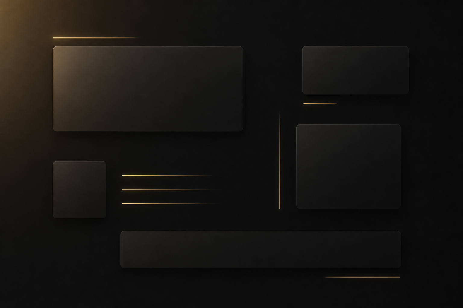
In interfaces noemen designers dit vaak macro- versus microwitruimte. Macro is de ruimte tussen grote blokken: secties, kaarten, footer versus content. Micro is de marge tussen een label en een invoerveld, tussen twee knoppen, of tussen regels in een lange paragraaf. Beide tellen mee voor leesbaarheid en voor het gevoel van kwaliteit. Wie enkel naar macro kijkt, krijgt alsnog een druk formulier; wie enkel micro polijst, kan nog steeds een onrustige pagina-overzicht houden.
Designers often talk about macro versus micro whitespace. Macro is the space between large blocks: sections, cards, footer versus main content. Micro is the gap between a label and an input, between two buttons, or between lines in a long paragraph. Both affect readability and perceived quality. Polishing only macro can still leave a dense form; polishing only micro can still leave a restless overall layout.
Hiërarchie: wat eerst lezen?
Hierarchy: what should be read first?
Bezoekers scannen eerst. Ze zoeken een kop die hun situatie benoemt, een korte uitleg die belooft wat ze gaan vinden, en pas daarna details, prijzen of technische bijzonderheden. Daarom werken grote, rustige koppen met weinig woorden beter dan vijf zinnen in hetzelfde lettertype en dezelfde kleur. Ik let erop dat er per schermhoogte idealiter één duidelijke “held”: de belangrijkste boodschap springt eruit, de rest ondersteunt in duidelijk lagere gewichten.
Visitors scan first. They look for a headline that names their situation, a short line that promises what they will find, and only then details, pricing, or technical fine print. That is why calm, large headings with fewer words outperform five sentences set in the same size and colour. Ideally each viewport height has one clear “hero” message; everything else supports it with visibly lower weight.
Semantische koppenstructuur hoort daarbij: één h1 per pagina (meestal de titel), daaronder logische h2-secties, en waar nodig h3 om onderdelen te groeperen. Dat helpt schermlezers en zoekmachines de volgorde te begrijpen. Een kop omdat “het visueel mooi staat”, zonder echte onderverdeling, breekt die logica. Mensen merken het misschien niet bewust, maar ze voelen wel dat iets “niet klopt” als de volgorde willekeurig aanvoelt.
Semantic heading structure belongs with that: one h1 per page (usually the title), logical h2 sections beneath, and h3 where you truly subgroup content. That helps screen readers and search engines understand order. A heading chosen only because it “looks nice”, without real subdivision, breaks that logic. Visitors may not articulate it, but things feel “off” when order feels arbitrary.
Contrast, kleur en toegankelijkheid
Contrast, colour, and accessibility
Contrast is meer dan “donker op licht”. Voor gewone tekst hanteert WCAG 2.2 als vuistregel een contrastverhouding van minstens 4,5 : 1 tegen de achtergrond; voor grote tekst mag het iets lager. Kleine grijze tekst op een iets minder grijze achtergrond ziet er “stijlvol” uit in een ontwerpprogramma, maar valt buiten die norm en maakt lezen moeilijk in zonlicht of voor mensen met minder scherp zicht. Ik test combinaties liever met een contrastchecker dan op gevoel.
Contrast is more than “dark on light”. For normal body text, WCAG 2.2 commonly expects at least a 4.5 : 1 ratio against the background; large text may use a slightly lower threshold. Small grey type on a slightly less grey background can look stylish in a design tool but fail that bar and hurt readability in sunlight or for people with reduced vision. I prefer checking pairs with a contrast tool rather than guessing.
Accentkleuren (zoals een goudtint voor links en knoppen) mogen opvallen, maar de basis moet rustig blijven: donkere achtergrond met heldere bodytekst, of lichte achtergrond met donkere tekst. Wanneer alles tegelijk “accent” is, verdwijnt hiërarchie: niets trekt meer echt de aandacht. Eén of twee plekken waar kleur en gewicht samenkomen — bijvoorbeeld primaire knop en actieve navigatie — volstaan meestal.
Accent colours (like a gold tone for links and buttons) can stand out, but the base should stay calm: dark background with clear body copy, or a light background with dark type. If everything is an “accent”, hierarchy disappears: nothing truly pulls focus. One or two places where colour and weight meet — for example the primary button and active navigation — are usually enough.
Regelbreedte en verticaal ritme
Line length and vertical rhythm
Voor doorlopende tekst is een regel van ongeveer 45 tot 75 tekens (inclusief spaties) een veelgehanteerde bandbreedte: te smal en je oog springt te vaak naar de volgende regel; te breed en je verliest de draad halverwege de zin. Op brede desktopcontainers zet ik daarom vaak een max-width op de tekstkolom, ook al is de rest van de lay-out wijder voor fotogalerij of dashboard.
For continuous reading, roughly 45 to 75 characters per line (including spaces) is a widely used band: too narrow and your eye jumps lines too often; too wide and you lose the thread mid-sentence. On wide desktop canvases I often set a max-width on the text column even when the rest of the layout is wider for galleries or dashboards.
Verticaal ritme betekent: gelijksoortige elementen krijgen gelijksoortige afstand. Als één paragraaf 1rem marge heeft en de volgende plotseling 2,5rem zonder inhoudelijke reden, voelt de pagina “hakkelt”. Veel teams werken met een basiseenheid (bijvoorbeeld 4 px of 8 px) en stapelen marges daarop. Dat maakt onderhoud eenvoudiger: je wijzigt één schaal, niet tientallen losse waarden.
Vertical rhythm means similar elements get similar spacing. If one paragraph has 1rem margin and the next suddenly 2.5rem without a content reason, the page feels jittery. Many teams use a base unit (for example 4 px or 8 px) and stack margins from that. Maintenance becomes easier: you adjust one scale, not dozens of ad-hoc values.
F-patroon, Z-patroon en jouw lay-out
F-pattern, Z-pattern, and your layout
Gebruikersonderzoek (onder meer door Nielsen Norman Group) toont al jaren dat mensen webpagina’s vaak in een F-vorm scannen: eerst horizontaal bovenaan, daarna een tweede horizontale strook lager, en daarna verticaal langs de linkerkolom. Dat betekent niet dat elke site identiek moet zijn, wél dat cruciale woorden links en boven de vouw helpen — zeker op desktop. Op mobiel verschuift dat gedrag, maar het principe blijft: begin met het antwoord op “ben ik hier goed?” voordat je sidebars en secundaire links stapelen.
User research (including work by Nielsen Norman Group) has long shown that people often scan pages in an F-shaped pattern: a horizontal pass at the top, another lower horizontal pass, then a vertical sweep down the left. That does not mean every site must look identical, but it does mean key words on the left and above the fold help — especially on desktop. On mobile the behaviour shifts, but the principle remains: answer “am I in the right place?” before stacking sidebars and secondary links.
Voor landingspagina’s met één duidelijke boodschap zie je soms een Z-patroon: logo of merk linksboven, belangrijke actie rechtsboven, diagonale aandacht naar midden, call-to-action rechtsonder. Witruimte maakt die diagonaal leesbaar; zonder ruimte botsen de ankers en verdwijnt het spoor. Welk patroon ook past: het moet samengaan met jouw echte content, niet met een sjabloon “omdat het hoort”.
For landing pages with one clear message you sometimes see a Z-pattern: brand top-left, key action top-right, a diagonal pull through the middle, call-to-action bottom-right. Whitespace makes that diagonal readable; without room the anchors collide and the trail disappears. Whatever pattern fits, it must match your real content, not a template “because you should”.
Kaarten, knoppen en herhaling
Cards, buttons, and repetition
Veel KMO-sites gebruiken “kaarten” om diensten, testimonials of blogposts te tonen. Als elke kaart dezelfde hoogte, hetzelfde kader en dezelfde knopstijl heeft, leert het oog snel het patroon — dat is goed. Als één kaart plots een andere schaduw, andere hoekradius of een andere knopkleur krijgt “omdat die dienst belangrijker is”, breekt het patroon en moet de bezoeker opnieuw decoderen. Consistentie is geen saaiheid; het is een manier om mentale energie te besparen.
Many small-business sites use “cards” for services, testimonials, or blog posts. If every card shares height, frame, and button style, the eye learns the pattern quickly — that is good. If one card suddenly gets a different shadow, corner radius, or button colour “because that service matters more”, the pattern breaks and visitors must decode again. Consistency is not boredom; it saves mental energy.
Hetzelfde geldt voor knoppen: primaire actie één duidelijke stijl, secundaire actie een rustiger outline of tekstknop. Tertiaire links gewoon als onderstreepte of gekleurde tekst. Wanneer er vijf “primaire” knoppen op één scherm staan, voelt alles even dringend en wordt niets meer uitgevoerd. Witruimte rond de primaire knop — horizontaal én verticaal — vergroot de kans dat mensen de bedoeling snappen zonder te lezen als een contract.
The same goes for buttons: one clear style for the primary action, a calmer outline or text button for secondary, tertiary actions as simple coloured or underlined links. When five “primary” buttons appear on one screen, everything feels equally urgent and nothing wins. Space around the primary button — horizontally and vertically — increases the chance people understand intent without reading like a contract.
- Zelfde knopbreedte binnen één rij, tenzij je bewust “brede” en “smalle” varianten definieert.
- Keep button widths consistent within a row unless you deliberately define “wide” and “narrow” variants.
- Vaste volgorde van elementen in herhalende kaarten: titel, korte tekst, meta, knop — niet per kaart een andere volgorde.
- Fixed order inside repeating cards: title, short copy, meta, button — not a different order per card.
- Witruimte onder de laatste kaart in een grid, zodat de sectie niet “tegen” de volgende sectie plakt.
- Space below the last card in a grid so the section does not slam into the next block.
Tot slot: witruimte is geen luxe die je “later” nog wel bijstuurt — ze bepaalt mee hoe betrouwbaar en professioneel je zaak overkomt bij een eerste klik. Wie dat serieus neemt, hoeft niet luider te schreeuwen dan de concurrent; hij moet alleen duidelijker zijn.
Finally: whitespace is not a luxury you “fix later”; it shapes how trustworthy and professional you feel on a first click. Taking it seriously does not mean shouting louder than competitors — it means being clearer.
Witruimte en merkgevoel
Whitespace and brand feel
Een strakke, luchtige lay-out kan premium aanvoelen; een compacte, dichte lay-out kan dringend of budget aanvoelen — beide kunnen kloppen bij het juiste merk. Het probleem ontstaat wanneer je merk “warm en persoonlijk” wil zijn, maar de interface voelt als een spreadsheet omdat elke pixel gevuld is. Witruimte is dus ook een merkkeuze: hoeveel rust wil je uitstralen versus hoeveel informatie per scherm?
Airy layouts can feel premium; dense layouts can feel urgent or budget — both can fit the right brand. Trouble appears when the brand wants to feel warm and personal, yet the interface feels like a spreadsheet because every pixel is filled. Whitespace is therefore a brand choice: how much calm do you want versus how much information per screen?
In trajecten stem ik dat af met echte voorbeelden: welke pagina’s bekijken jouw klanten het vaakst na afspraak of offerte? Welke secties zijn puur juridisch of administratief en mogen compacter? Door per paginatype te beslissen — home, dienst, contact, formulier — blijft witruimte een bewuste beslissing in plaats van “wat er overblijft”.
In projects I align that with real examples: which pages do your customers open most after a call or quote? Which sections are purely legal or admin and can be tighter? Deciding per page type — home, service, contact, form — keeps whitespace intentional instead of “whatever is left over”.
Praktisch voor jouw zaak
Practical takeaways
Vraag jezelf af: kan iemand in tien seconden zeggen wat je doet, voor wie, en welke volgende stap je verwacht? Zo niet, haal tekst weg of verplaats die naar een tweede pagina. Liever één duidelijke boodschap dan drie half uitgewerkte ideeën boven de vouw. Dat is geen gemakzucht — het is respect voor de tijd van je bezoeker en het verkleint de kans dat mensen afhaken voordat ze je aanbod begrijpen.
Ask: within ten seconds, can someone say what you do, for whom, and which next step you expect? If not, cut or move copy to another page. One clear message above the fold beats three half-baked ideas. That is not laziness — it respects your visitor’s time and reduces bounce before people understand your offer.
Wil je dit laten doorlichten op jouw bestaande site? Tijdens een gesprek kijk ik mee naar koppenstructuur, contrast, regelbreedte en waar witruimte nu onbedoeld “lawaaierig” of juist te krap wordt — zonder meteen een volledige redesign te forceren. Soms zijn kleine typografische en spacing-aanpassingen genoeg om dezelfde inhoud veel professioneler te laten aanvoelen.
Want this reviewed on your current site? In a call we can walk heading structure, contrast, line length, and where whitespace accidentally feels noisy or too tight — without forcing a full redesign. Sometimes small typographic and spacing tweaks are enough to make the same content feel far more professional.
Ik noteer ook welke secties later dynamisch groeien — nieuws, jobs, releases — zodat je witruimte niet alleen mooi is op dag één, maar ook wanneer er vijf extra kaarten bijkomen. Voorkomen is goedkoper dan achteraf alles herschikken.
I also note which sections will grow dynamically — news, jobs, releases — so whitespace looks good on day one and when five more cards appear. Prevention is cheaper than reflowing everything later.